Pressure Testing a Design System Update for High-Frequency Users
TL;DR
I led a quantitative research study to ensure that updating Merrill Edge’s design system wouldn’t cause friction in the flow of day traders, a specific type of user that places multiple trades throughout the day. After conducting click tests, I manipulated and analyzed data to identify the design with the highest success rate. I translated the results into actionable recommendations to guide the design team when updating the system.
Merrill Edge is a self-directed investing web and mobile platform that was updating their design system.
Product
The design system was being updated across products, including Merrill Edge. Because the update was an ongoing process, stakeholders needed to know which design to implement ASAP. Given the resources available to me, I was able to conduct the end-to-end study and generate actionable insights over 3 weeks. While updating the design, we needed to ensure that power users (also known as day traders) wouldn’t experience friction when placing multiple trades each day. If high-frequency users experienced too much friction, Merrill Edge would be at risk of losing users to other self-directed trading platforms.
When users view all of their holdings on Edge’s homepage, they have the option to quickly access the most frequently performed actions, also known as the quick actions menu.
Background
The quick actions menu includes:
Full Trade
Quick Trade
Set Alerts
Other options
For this study, we wanted to ensure that usability of the quick actions menu wouldn’t be affected by updating the design system.
After collaborating with UX designers, we determined that the following design components could be manipulated to represent the quick actions menu:
Location
Amount of text
Use of symbols
Objectives
Research Questions
After identifying the design decisions that this research would be influencing, I was able to identify the following research questions:
Where should the quick actions menu be placed?
How should the quick actions menu be visually represented?
I conducted a power analysis to determine that a sample of 200 participants would yield statistically significant results
Participants were recruited from an Ipsos panel of Merrill Edge users who reported that they placed a trade at least once a week
Study Design
🚨Roadblock🚨
Designers wanted to test several different concepts, with slight variations in text or symbols.
My research instincts told me that participants would exhaust their cognitive load with too many concepts, leading to decreased motivation in the task which would subsequently decrease the quality of our test data.
I communicated my concern to my design partners and collaborated with them to identify the design decisions that this study’s results would inform. Once we identified the design decisions, we were able to move forward with selecting the concepts to be tested.
I collaborated with the design team to narrow down the number of concepts being tested, focusing on concepts that showed various locations and visual representations of the quick actions menu. Because we already had prototypes of the updated design, I decided to conduct a click test (via UserZoom) using the following concepts:
For each concept, a success was defined by if the participant clicked an area within the green box,
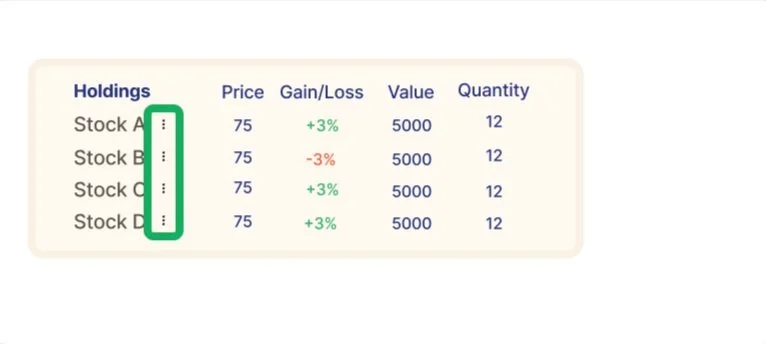
Design A
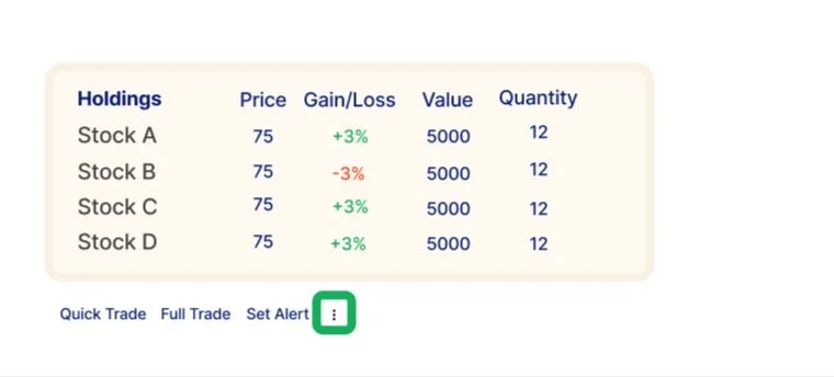
Design B
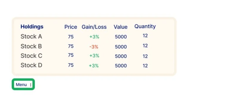
Design C
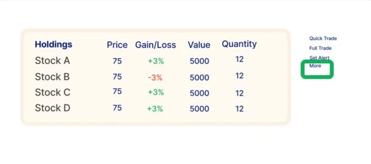
Design D
***these are high-level concepts for illustrative purposes only***
Once 200 participants completed the study, data collection stopped. I cleaned and analyzed the data to answer my research questions with the following metrics:
Time
To first click
Total time on task
Success rate (whether the participant clicked on the quick actions menu)
For first click
For any click
Data Analysis
for the stats nerds
UserZoom recorded success rate as a string variable, so I had to code whether the participant was successful as 1, and if they weren’t successful as 0. Because success rate (for first click and for any click) are discrete/binary variables, I conducted a Chi-square test to determine which concept performed the best (highest success rate). This analysis compared whether one success rate was significantly higher (statistically) compared to the other success rates.
Because time to first click and total time on task are continuous variables, I conducted an ANOVA (analysis of variance) to determine which concept performed the best (least amount of time). This analysis compared the mean amount of time (to first click and total time on task) between the four concepts, to determine whether any of the differences were statistically significant.
Example output from ANOVA
Example output from Chi-squared test
The statistical analyses revealed that Design A had the highest success rate, and Design B had the second highest. There were no significant differences in time to first click or total time between the concepts.
Results
Design A
Design B
I translated the statistical analysis results into actionable design recommendations based on the defining features of the most statistically successful concepts. I presented the following actionable insights to stakeholders:
The quick actions menu should be visually represented with the kebab menu
The symbol for the quick actions menu should be located right next to the holding
If stakeholders were set on using text to represent the quick actions menu, I recommended including the first few menu options before including a kebab symbol
Insights
Before conducting this study with a large sample, I would’ve liked to conduct usability testing with a smaller sample size (via interviews) to have a better understanding of the user’s thought process. By conducting more in-depth research with a smaller sample, we could have identified any other pain points in the existing design that could have been included in this click test.